From T3 to T4: Usability and User Experience
The findings of this research played a key role in the development and the choices revolving the design of TMWalker4, and still do.
Usability
In short, three main points were mentioned about the usability of TMWalker3; users wanted to feel supported and helped, they wanted reliable data and insight into this reliability and they wanted to use the software more efficient. This seems an easy task, but when you start to think about it it is rather complicated. What one user sees as the ultimate experience does not has to be the same as for a different user. One would maybe want to be able to check all data, whereas someone else might only be interested in the results.
We have taken on a situational approach. For example, we replaced the settings of TMWalker3 – which were perceived as complicated – by default values and a wizard in which a user is guided through the difficult concepts. We are also currently creating training video’s that we want to give a visual spot in the application.
We could write a separate blog about the completeness and reliability of the source data. One of the new things in TMWalker4 is an exemption administration, where users can exclude data for specific purposes. E.g. with heavy snowfall, one might exclude the bus rides of that day for a punctuality calculation.
To improve efficiency, we choose to create an easy way for editing analyses afterwards and communicating the information to coworkers. Our users used to make an Excel export, change it and save it on a local server, before sending it via e-mail. In TMWalker4 there is a new spreadsheet functionality. Here the export will appear in one single click and can be shared, all within the application, with other users.
Framework
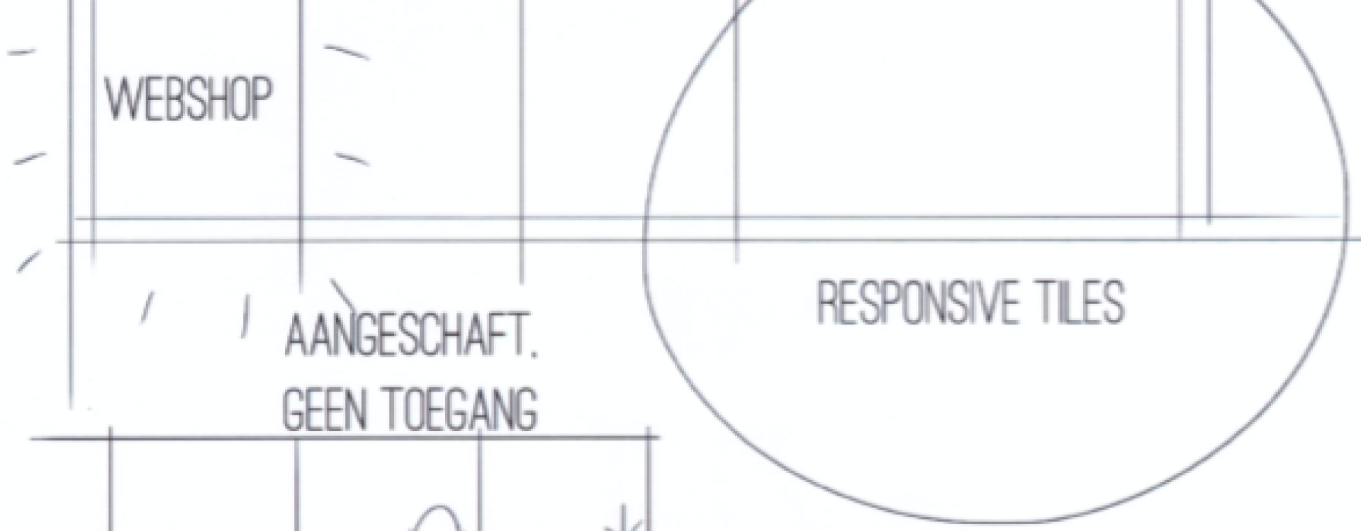
There was one clear wish revolving around the framework; our users wanted a modern interface, seeing as it would fit better with the other software they are using. For this reason, TMWalker4, starts with a tile screen with responsive tiles. Fonts, icons and colours have a Windows 10 look and feel.
Content information
After an extensive discussion about the possibilities for the information, the following three points were discussed in the results. Users want to combine and compare data, users want to know about the context of data and information flows, to make sure everything runs smoothly.
In the new Architect-app, now available, there are new – combined – analyses possible. We are also working hard to give the traditional overviews a spot on a geographical map. But we will tell you more about this soon.
TMWalker4 logs everything that happens. Not just company data, but also the use of the application itself. Not so much with a controlling mindset, but with Process Mining techniques in mind. This can give a great insight into how the application is actually used and improve it based on real data.
The ultimate user experience
TMWalker4 would have the ultimate user experience according to the research if it stimulates innovation for the users and allows them to work together easily. Users also wanted to be able to build extra applications in the software.
The structure of TMWalker4 is made so that technically trained users should be able to add functionalities, using applications such as DataBank, Dictionary and FlowBuilder. The structure is already there. We are still looking for a way to offer this in a user-friendly and easy way.
Concluding
A quick insight into an extensive research, which helps us to develop continuously. If this blog inspired you into new wishes or ideas, don’t hesitate to contact us.


0 Comments